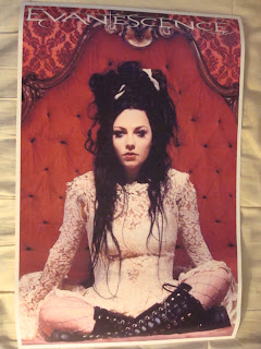
I recently acquired 2 posters! I know my walls are covered in a bunch of gothic stuff, but I like to add more things to mix it up. I recently acquired these two posters:
Different, right? :P
I've wanted that Evanescence poster for a long time now, and this HIM poster has been in my psyche for a while now too. It seemed suiting that I bought them already. I never took too much time to really LOOK at these posters until I had them on my bed and started taking photos of them. For example:
The wallpaper in the background, the awesomeness of the bed, and the text used to spell "Evanescence".
Then, looking at Amy, look at that hair.
It's braided and pinned, with random white ribbons and bows throughout. I love it. Her dress too.
It matches her hair. All tattered and messy, yet classy and beautiful. It's so frayed.
And if you look closely, there are several safety pins keeping the sleeve attached.
Like this big one, how did I ever miss that?
And there is also a big tear on her (ahem) blouse. If you look underneath, she's wearing a sort of sports bra with no shirt underneath. I always thought she was wearing a corset underneath!
Finally looking at the boots, I realized- ... I HAVE these boots! The zippers are broken, but I can lace them up all the way and still wear them, but I have these NaNa boots. They leaves hearts on the floor when you step in puddles. :3
Squee! And now, moving on to the HIM poster
He's smoking a cigarette! How did I ever NOT notice that? And earrings too.
He's wearing eyeshadow that matches the background! I love a man that coordinates.
This design used is awesome too. I always saw it, but now I can SEE it.
His jacket has fur (feathers?) around the collar.
His fingers are pointing down to his (ahem)... pants. *blush*
So now that I had this awesome poster, I taped it onto my door like this:
It looks... nice. But I always like to make something out of nothing. It NEEDS a frame, or... something. My door is too white and plain. I started looking around my room and I found my salvation- RIBBON!!!
I got some thick black ribbon and started at the top middle, just draping it in a lovely way and twisting it so it curled down to the bottom, taping it along the way. Then I did the same with another piece of ribbon.
I threaded it where the first ribbon didn't go, taping it down and curling it so they overlapped in several places. The bottom was plain, so I got another length of ribbon and did this fancy little number:
Searching along, I found a small black feathered boa that I knew I would never use, so...
MUCH better. I still think it's a bit plain, but I will add on to it later. I'm happy with this for now. Even if it isn't an official frame, it has the same quality that a frame would bring. I'm so happy with this result. How do you guys fancify your posters? <3!


4 comments:
Wow, what a really good idea! I used to really be into HIM -- starting to get into them again -- and I wouldn't mind having that poster. I'm not really sure where I would put it, though ..
Thank you. Yeah, I lurve Vile and all his music. I have a LOT of random stuff on my walls. I had to clear some stuff off my door to have room for my poster. Gothic Spring cleaning, you know. :P <3!
You need to accent my posters...in a manly way
Dillon- then... use caution tape! Haha! My HIM poster is already *ahem* effeminate with the pinks and the feathers, I'm merely accentuating what's already there. :P <3!
Post a Comment